Follow to Best Graphics Design Trends in Future
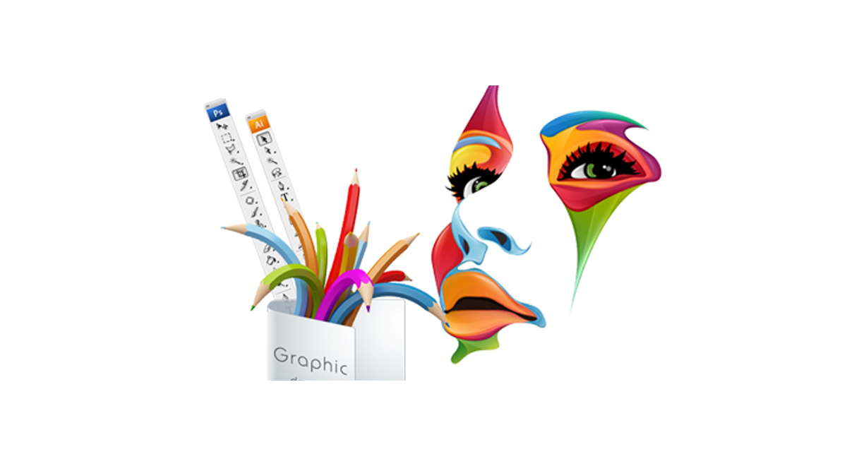
Graphic design has become the essential part of the business. Even in our day-to-day life, we notice the graphic design everywhere like on packets, books, posters, website, magazines, wall art, signage etc. It makes the thing look more attractive and appealing. It has become the need of every one. They are the success factor behind any company as it starts from brand recognition to production to packaging.
The trends of graphic design change from time to time. It is the ever-growing process. So, it is important for each and every business or individual to get updated with the latest trends in graphic designs.
Let’s check out latest trends of graphic designs 2017
1. Bright and loud colors- The trend has changed completely from sober colors to the bright colors. The earlier designer used safe colors like white, gray, black, neutral, etc. Now the color of the year is green. The designers focus on colors from nature. Companies are re branding and giving new and fresh looks by using bold colors.
2. Bold typography- Typography is popular for the brand identity of the business. The trend is to use bold and beautiful typography to attract people. You can add vibrant colors, texture, and big text size to get an appeal. You can also use bold and playful titles to stand out from competitors.
3. Shapes and patterns- The flat design and solid pattern are spotted in 2016. Now the trend has moved towards geometric pattern and nature inspired patterns. The pattern does not mean using many colors instead using organic line patterns are more popular.
4. Retro and modern- These designs are based on the style from early 80’s and 90’s mix with the modern touch. It is the fusion of old and modern version. It looks authentic, simple and modern. Brown and gray vintage designs are now seen in candy colors. Earlier retro designs are used in the logo now you can see them everywhere.
5. Material design- Material design is very important for business. Thus, it has large scale typography, a bold image, edge to edge imagery and deliberate choice of colors. The designs are made on reality basis like the lightweight and minimalistic.
6. Fancy illustrations- The illustrations are very fancy like you can take the example of Vodafone Zoo Zoo. It is unique and creative. Here designers are working to create powerful illustrations to make you stand out in the competition. These designs are based on superhero images, brush strokes, sketchy lines, digital and analog, isometric projections etc.
7. Cinemagraph- It is the simple and effective form of graphic designs. Now marketers and designers are working on the each and every small thing which grabs audience attention. Basically, cinemagraph are still images with little movement. Like you can take the example of Pepsi advertisement, it has a beautiful cinemagraph. This technique makes simple photo like a glass of water more realistic with realistic water view.
8. Modular layouts- The modular layout is not new but it has become more popular. The long block text appears boring on websites or prints. The modular layout is a great management tool for any web design or prints.
9. Minimalism- The minimalist trend is up to 2017. The importance of white space is more than black space. It looks better because of simplicity. Many brands are focusing on minimalism just like for e.g. Apple. This year the minimal typography and layouts give a more elegant look. It is also seen the subtle metallic foiling has also become popular on any color.
10. Google fonts- Now a day, you have 810 different Google fonts free of cost. It is a versatile option for graphic design. The Google fonts have become popular in 2017 as it looks nice on every blog and on websites. People tend to like free things a lot. Designer loves to use Google fonts.
11. Hand drawn graphics- Recently we have seen brands in a different way. Earlier this trend looks unprofessional, but it has become very popular. For e.g. Dropbox is using hand drawn graphics and images in everything they do. They are easily recognized. It is best for brand recognition. Mailchimp is also using hand drawn icons.
12. GIF- we all love GIF effect as it supports to express emotions. It does not require any software. You can use GIF in blog posts, articles, etc. It draws attention to the post.
This year, design has taken a whole new approach. They are more innovative, attractive and beautiful.
Author Bio: Maggie sawyer is a professional web developer, a blogger by hobby and expertise in providing the best psd to wordPress service at very affordable range. Presently she works for MarkupHQ Ltd., a web development service provider company with a global reach. She passionate about sharing ideas and thoughts related to WordPress customization.



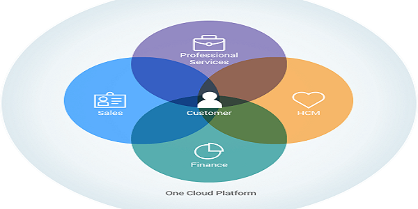

Enhance The Capabilities Of Your Business With Salesforce Professional Services
Why Your Business Must Invest In Responsive Website Design?
Enhance The Capabilities Of Your Business With Salesforce Professional Services