Common Web Design Mistakes That Affect SEO

If you are not getting traffic despite publishing great content, the chances are high that you have committed a web design mistake. Thankfully, it is pretty easy to find such a mistake.
SEO has become old enough to look at the best industry practices and find out what you are doing wrong.
If you don’t have enough time to check the code of every great website, we are here to help.
Not Optimizing the Loading Time
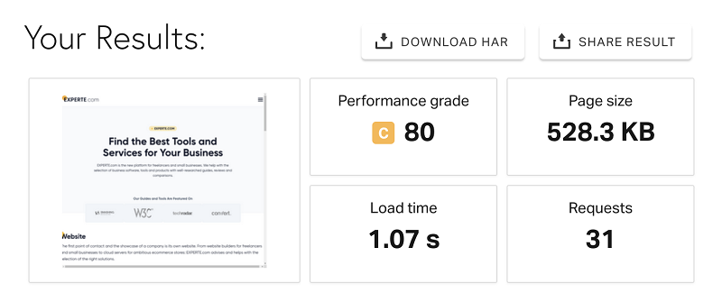
Google (and other search engines, too) has repeatedly said that load time is crucial for SEO. So much, big websites lose hundreds, even thousands, of potential customers for every second of load-time delay!
A terrible website load time could bite your business harder than your competitor.
Thankfully, Internet has a load of tools that can help you fasten load time. The best examples would be Google Developers PageSpeed Insights, GTMetrix, Pingdom, etc.
Consult your technical team and aim to reduce the load time to 1 to 2 seconds. Anything beyond that is going to increase the bounce rate.
Not Going Mobile-first
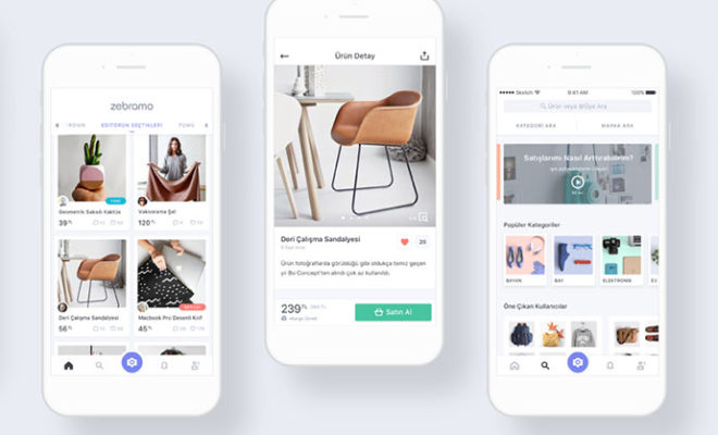
There was a time when websites were first designed for big screens and later optimized for mobile. It’s 2022, and the tables are turned. No matter your industry, you will get the most visitors using mobile devices.
What does that mean?
Go mobile-first.
See how we have optimized our website for all devices.

You should consider your mobile users when designing or re-designing your website. Make menus, CTA buttons, content, etc., while keeping mobile users in mind. Once your website is ready, optimize it for desktop users.
After all, those users should be catered first to give the most for your bread and butter.
Mismatch of Fonts & Colors
Nothing upsets a website visitor more than seeing ugly color combinations and weird fonts. Although search engines do not discriminate based on fonts and colors, your bounce rate goes off the charts if you mismatch them.
Unless your website books tickets for heavy metal music concerts, you should play safe with fonts. After you pair font families once, never change them on the pages.
Similarly, you should stick to the same color palette throughout your website. Both these design aspects help decrease the bounce rate and stick your brand in the visitor’s mind.
Not Using Proper Content
An average internet user has become smart enough to look at a website page and know within seconds if the page can solve their problem or not.
If they see a page with thin content and lots of white space, they know it’s not good enough. And if they see thousands and thousands of words, they leave because they don’t have enough time to read.
While writing content for a page, remember that you don’t have to just solve the visitor’s problem with your content; you also have to keep its size ideal. Mix white space with dark text to create a visually appealing page.
Not Using Images With Text
Use images if you want to engage your visitors. Yes, text can educate the visitor about your product, service, or other topics. But only images can get them engaged with the text and leave a mark on their mind.

When we say use images, we don’t mean generic stock images. If possible, you should invest a little resource into graphic designing and making infographics for your websites.
If infographics are overkill for your website, you can select hyper-relevant images for the web page’s content.
Not Using Clear Navigation
Your potential customer lands on your website and doesn’t jump off (thanks to the fast-loading page and attractive design).
She is impressed with your content and wants to know more about your business. You are about to hit the bull’s eye with a sale, but the big problem is poor navigation.
Always group the website pages into clearly-named categories.
Arrange these categories into the main and secondary menus so users can navigate them easily. Just like fonts, you shouldn’t experiment much with navigation.
For example, mobile users usually see a hamburger menu on websites. So, if you stick to the industry standard, like the hamburger menu, you will leave less room for your users to do guesswork.
Not Adding Clear CTAs
Use a clear call to action (CTA) wherever it is needed. A general thumb of rule is to put the CTA at the end of the content or page.
See how Apple has used CTAs on its website.

Sometimes, CTAs like ‘Subscribe To Newsletter’ or ‘Download E-book’ can be used inside the content. Whatever the position, do not miss a chance to use CTA.
But you also have to know this – an unclear clear is as good as no CTA. Use the following checklist to make clear CTAs:
- There should be only one CTA for one piece of content.
- Use contrasting colors for CTA buttons.
- Never interrupt the flow of content with a CTA.
Popups Spamming
Use popups for conversion but with caution. They can increase signups or sales but are notorious for ruining the user experience.
One irrelevant popup and the visitor will click on the back button, eventually increasing the bounce rate and hurting SEO.
So, is there any right way to use popups?
Yes, there is. Use the following tips to design a highly converting popup:
- Use a catchy but relevant headline in bold text.
- Write a short and clear description below the headline on why the user should buy or signup.
- Always use popups that are relevant to the content of the page.
- Give the users a way out if they do not want the popup. An unclear cut button can irritate the website visitor.
Missing Heading/Subheading Tags
Search engines are not humans. They can’t know that a sentence is a headline just by seeing its large size and bold fonts.
“By adding tags, you have to do handholding and let the search engine know about headings and subheadings,” says Keon Hoffman of Haitna Digital.
Use only one H1 tag per page. The H1 tag is the most important and tells the search engine about the main topics.
After using an H1 tag for the heading, use H2, H3, and H4 tags according to the content. And now that you have come this far, you should also put image alt text for image SEO.
Messing Up Infinite Scrolling
While implementing infinite scrolling on your website, consider that user experience and SEO should go hand in hand.
If your website contains a lot of content, it is okay to use infinite scrolling. However, its execution should be done with proper care.
Talk to your web developers and ensure that Search engine bots can crawl the second content of the page once the visitor scrolls down.
Monitor the crawlability issues closely; if the infinite scroll hurts the SEO, you are better off without it.
Not Creating Custom Error Pages
Design creative error pages to retain visitors to your website.
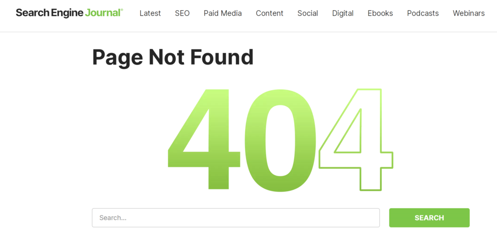
Yes, you might already have told your web developer to create 404 error pages, but that is not enough to retain visitors. A plain white page with dull black 404 text pushes visitors to click the back button, increasing the bounce rate.
Create a clear ‘Go To Homepage’ button on the 404 error page. Accompany the text with a creative image that solidifies your branding.
See how search engine journal has used 404 on their website.
Key Takeaways
- Improve website load time to reduce bounce rate.
- Create a visually appealing mobile-first website with the same font pair and color palette on the whole website.
- Keep your CTA short and crisp.
- Create quality content that is neither too thin nor too long.
- Lead the website visitors to your main pages with clear navigation.
- Add relevant H1 to H6 tags for search engine bots.
- Use a simple backend coding technique if the infinite scroll hurts the website’s SEO.
- Create custom error pages to retain visitors.









Enhance The Capabilities Of Your Business With Salesforce Professional Services
Why Your Business Must Invest In Responsive Website Design?
Enhance The Capabilities Of Your Business With Salesforce Professional Services